Notes we’d send a friend
Updates from projects we're working on and lessons we're learning.
Sent when there's actually something to say.
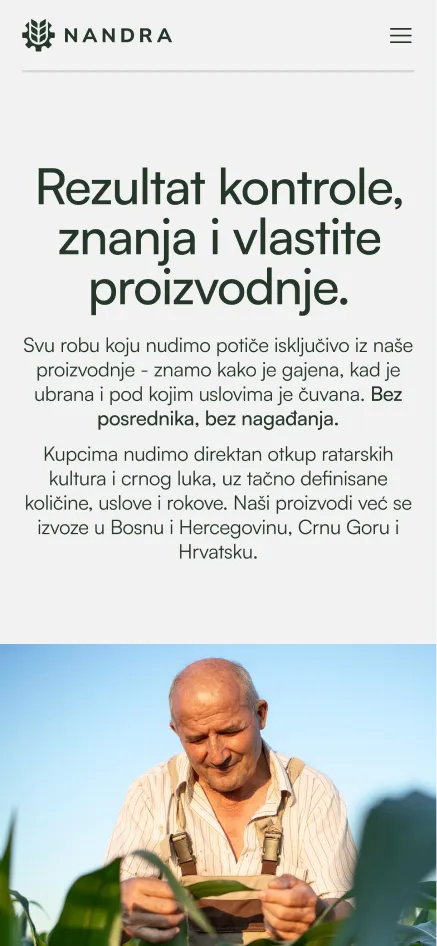
Nandra is a family agricultural company from Vrbas with two decades of work behind them, covering vegetable production, full field services, and civil earthworks with their own machinery. Their existing clients knew them well, but anyone outside that network had nothing to find. For a company that relies on building trust with other businesses, that kind of first impression was working against them before any conversation even started.
B2B Credibility Established
Brand Deliverables
We came into this project knowing we weren't building a brand for a corporate agricultural supplier. Nandra is a family business, two generations deep, and that's not a detail you work around, it's the whole foundation. So instead of pushing them toward something modern for the sake of it, we focused on building something honest and durable that could hold up across every touchpoint.
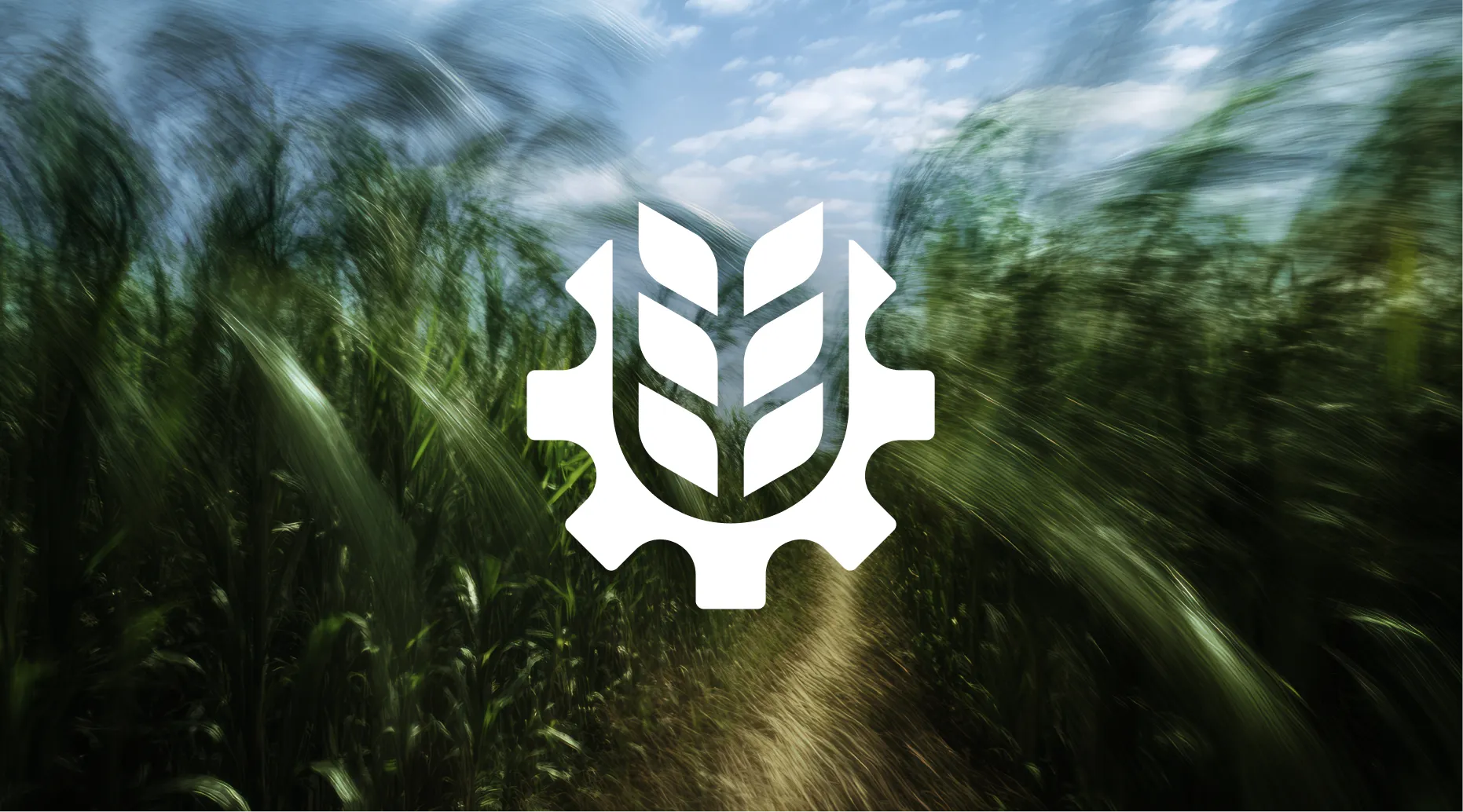
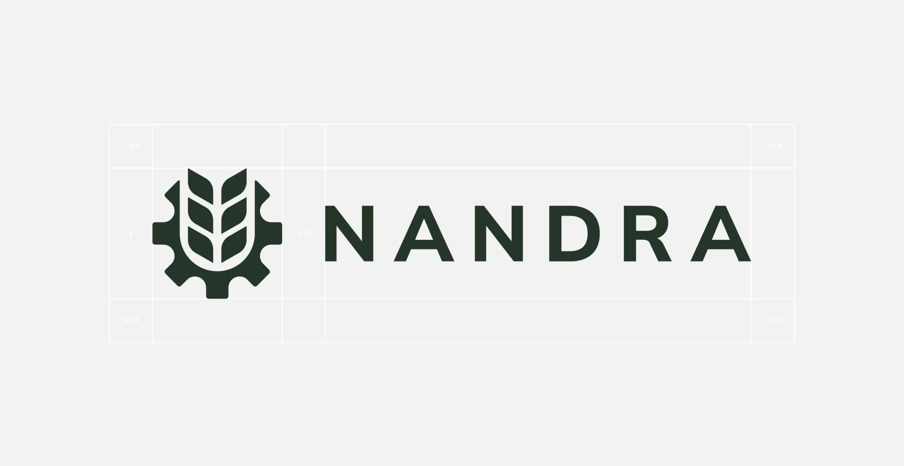
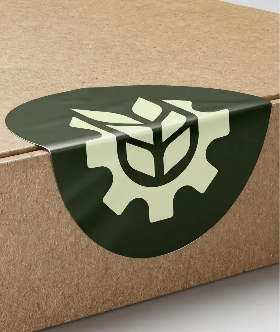
The logo brings agriculture and mechanization into a single mark, which is exactly how Nandra operates. The deep green feels like the land they work without trying too hard to say it. Everything was chosen to look as credible on a partner's desk as it does on the side of a machine in the field.


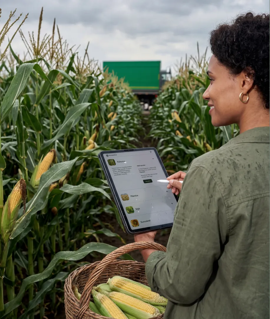
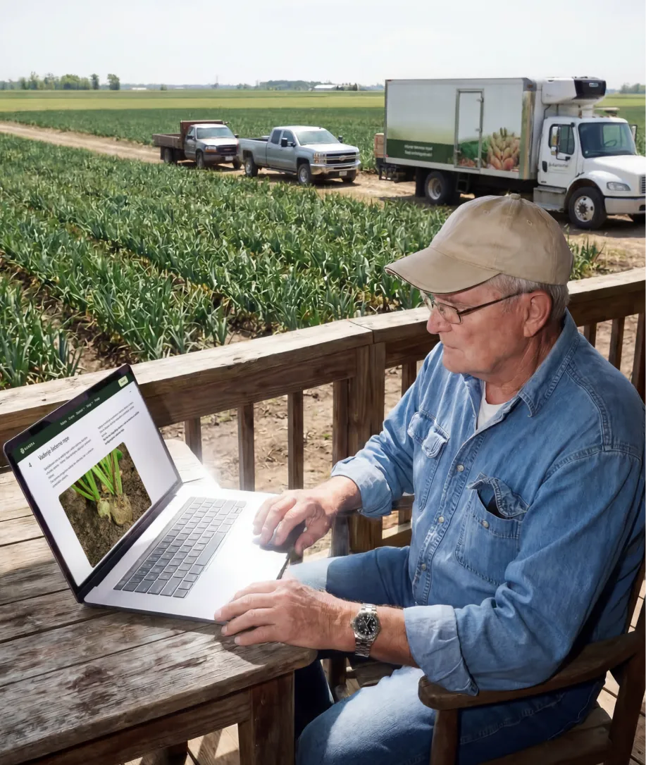
The website covers everything a potential partner needs before they make contact: what Nandra produces, what services they offer, how the process works, and who they already work with, including Syngenta, Delta Agrar, and Corteva. Clean structure, plain language, built for people who come in knowing what they want. The email signature followed the same system, so every message they send out carries the same identity.
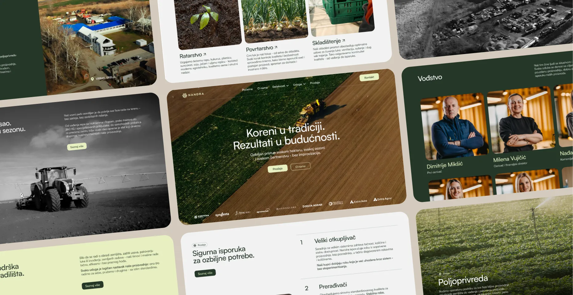
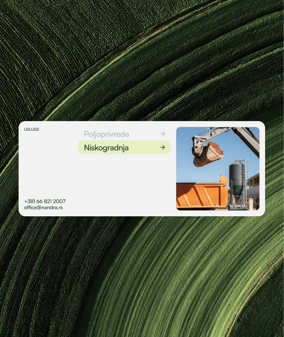
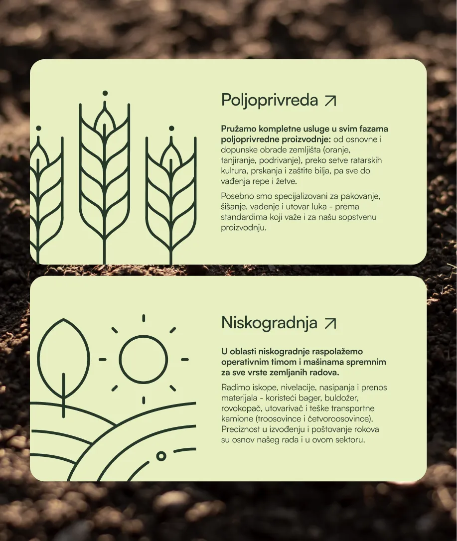
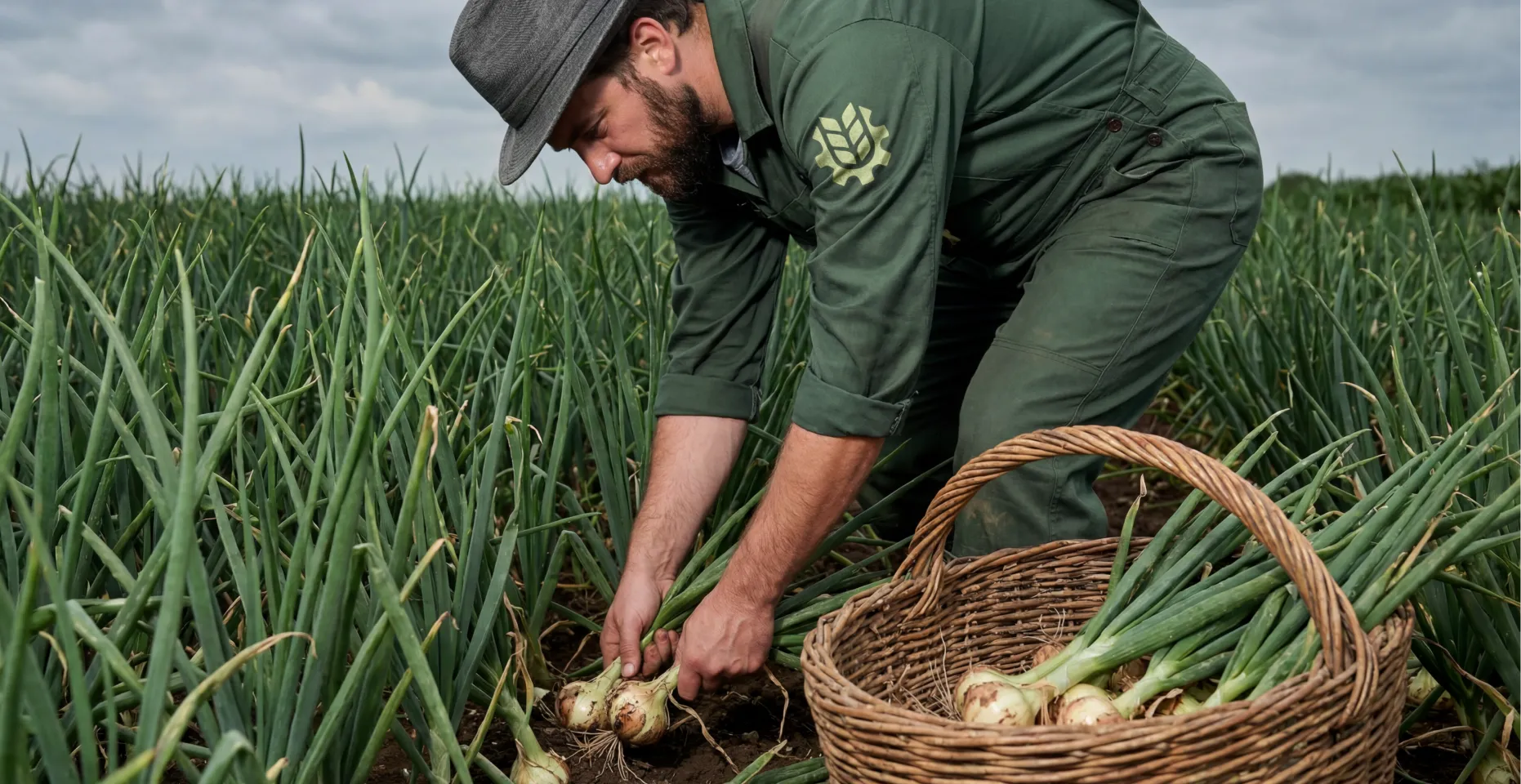
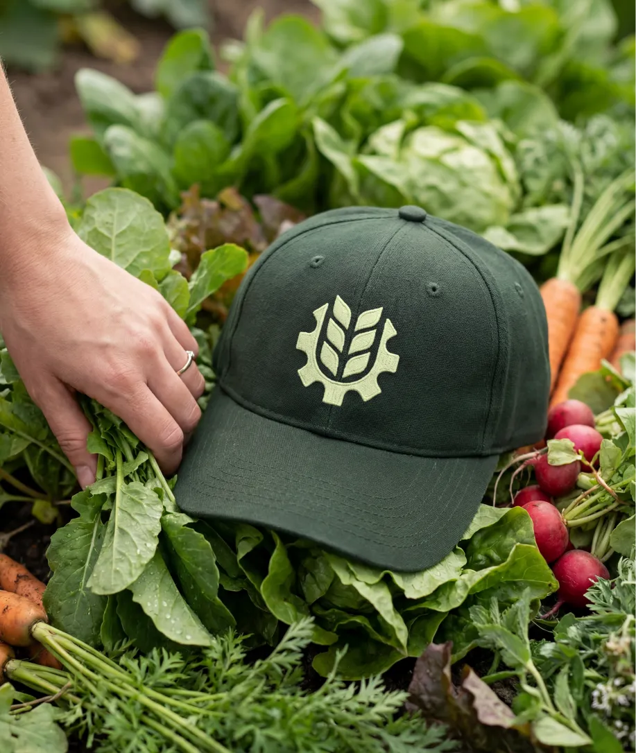
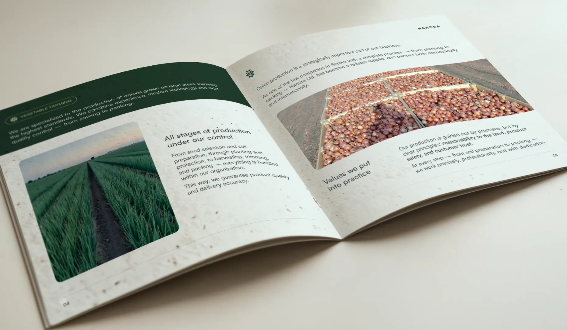
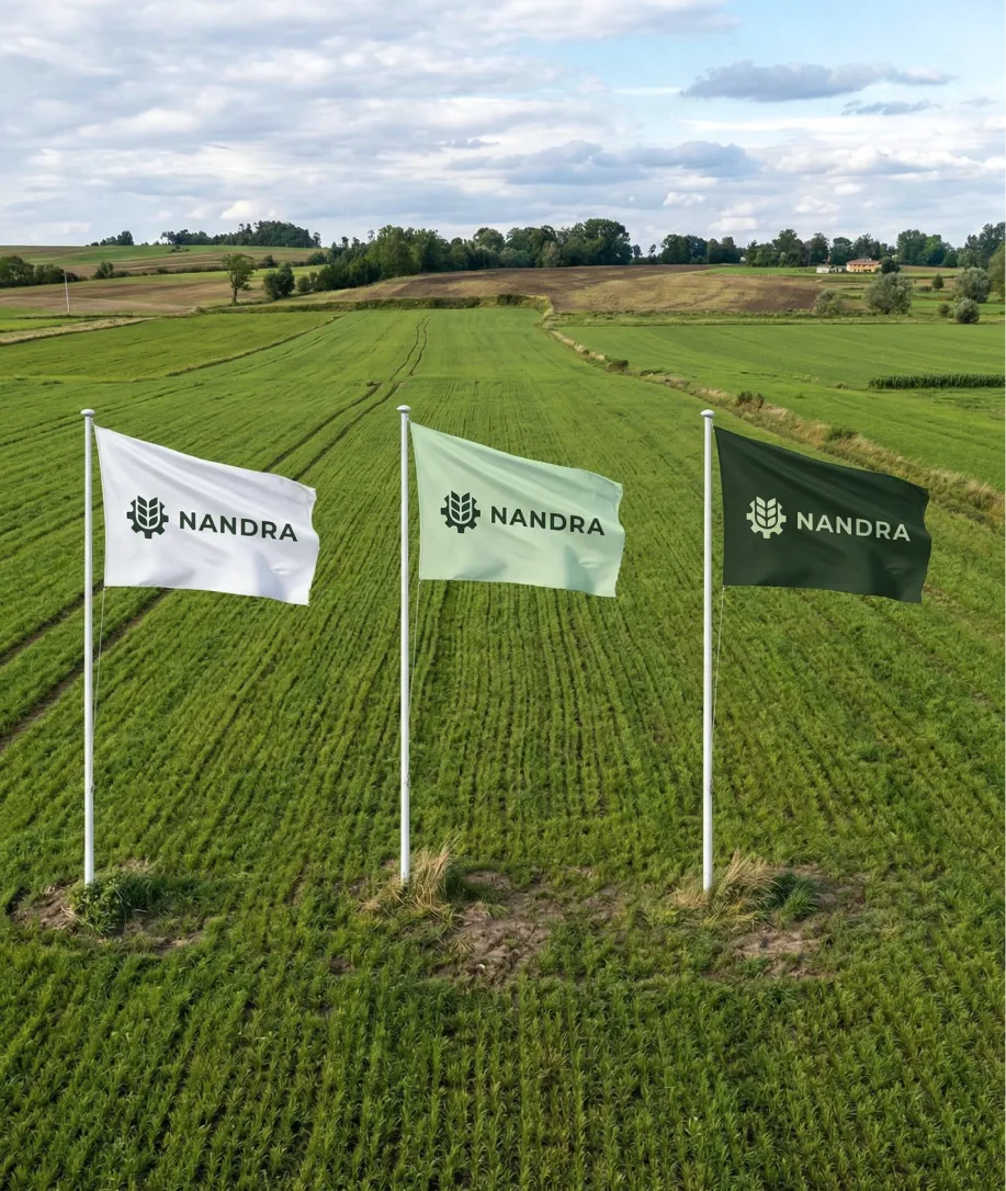
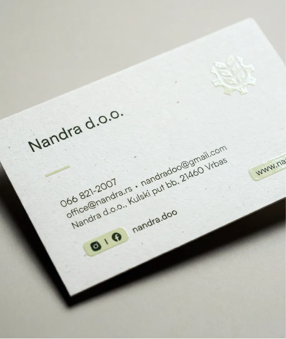
The print work covered every surface Nandra shows up on outside of a screen. Business cards and letterheads for partner meetings, a brochure covering both their agricultural and civil works services, construction site boards and flags for on-site visibility, and branding applied directly to their machinery. The same identity that lives on their website now travels with their equipment into every field they work on.
Nandra went from having no presence to having a brand that works across every surface they operate on. Any potential partner who looks them up now finds a website, a clear picture of what they do, and an identity that reflects the scale of their operation. The work they were already doing finally looks the way it should.

Aleksandra Nikolić
Sales Manager
We are extremely satisfied with the cooperation. From the very beginning, they showed a high level of professionalism, understanding of our needs and patience. Deadlines were met, communication was fast and clear, and the end result exceeded our expectations. Every recommendation for anyone looking for a reliable and quality team!
It depends entirely on scope. A logo and basic guidelines is a very different project from a full identity system with a website, brochure, signage, and vehicle branding. You can use our calculator on the Get Started page to build your own estimate based on what you actually need, and we'll confirm the final number after a discovery call.
Yes, and Nandra is a good example of why. Their existing partners knew them well, but any new potential partner who received their contact information had nothing to verify. A website is not about replacing relationships, it's about supporting them with something credible to land on.
For a project of this scope, typically 8 to 12 weeks. Branding takes 4 to 6 weeks, and the website runs in parallel or follows directly after. The timeline depends on how quickly feedback and approvals move on the client's side.
At minimum: a logo system, color palette, typography, and brand guidelines. For companies like Nandra that operate across multiple physical touchpoints, the scope grows to include business cards, letterheads, brochures, signage, and vehicle branding. The goal is consistency across every surface the brand appears on.
Yes. Vehicle and equipment branding is part of what we delivered for Nandra. For companies that operate in the field, machinery is often the most visible part of the business. It makes sense for it to carry the brand.
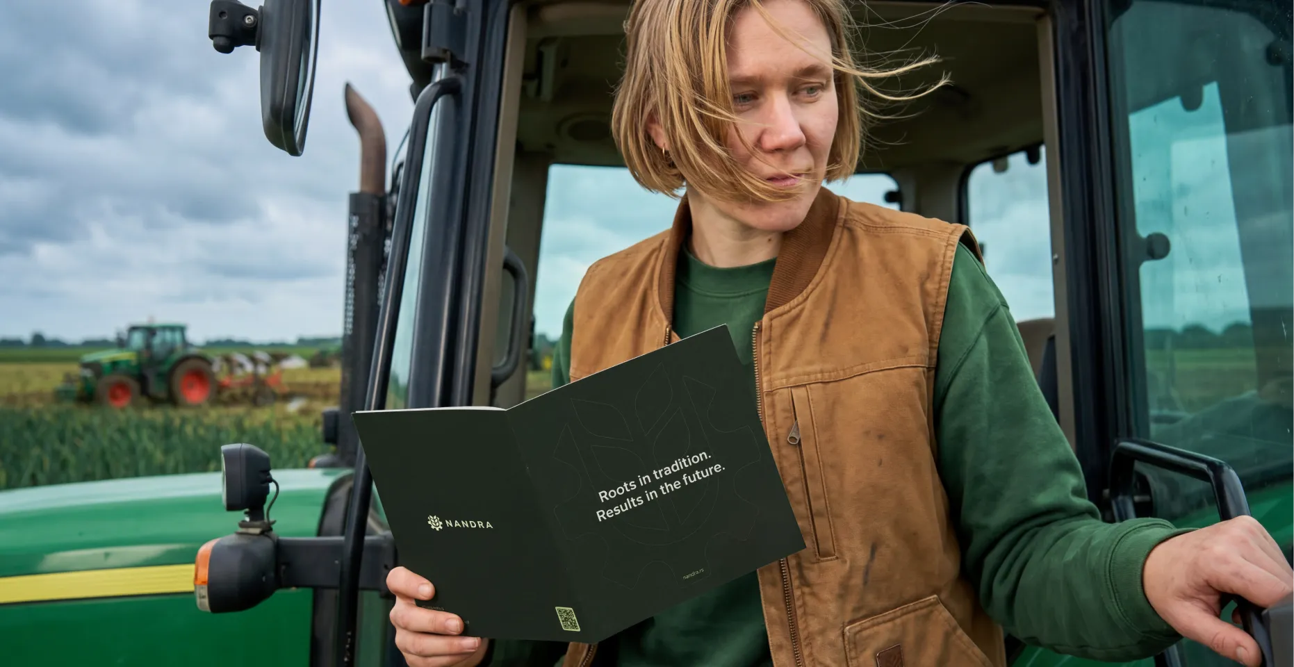
In B2B agriculture, print still matters. A brochure handed to a potential partner during a meeting carries weight that a website link does not. For Nandra, we produced a brochure covering both their agricultural services and civil works, which gave partners a complete picture of the business in a format they could keep.
The character of a family business is usually its biggest asset. The goal is to make that visible, not to replace it with something generic. For Nandra, everything we built reflects how they actually operate: grounded, direct, built for the long run. The brand system is professional without being corporate.
A style guide documents how your brand should look and behave across different contexts: how the logo is used, which colors appear where, which typography is used for headings versus body text, and so on. Without one, every new material someone creates risks looking slightly different from the last. For a company like Nandra that operates across print, digital, signage, and vehicles, a style guide is what keeps everything consistent over time.
Updates from projects we're working on and lessons we're learning.
Sent when there's actually something to say.