
Notes we’d send a friend
Updates from projects we're working on and lessons we're learning.
Sent when there's actually something to say.
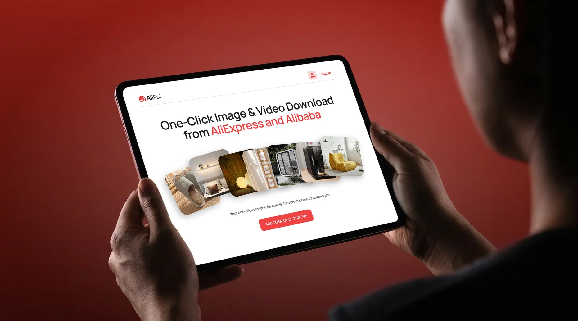
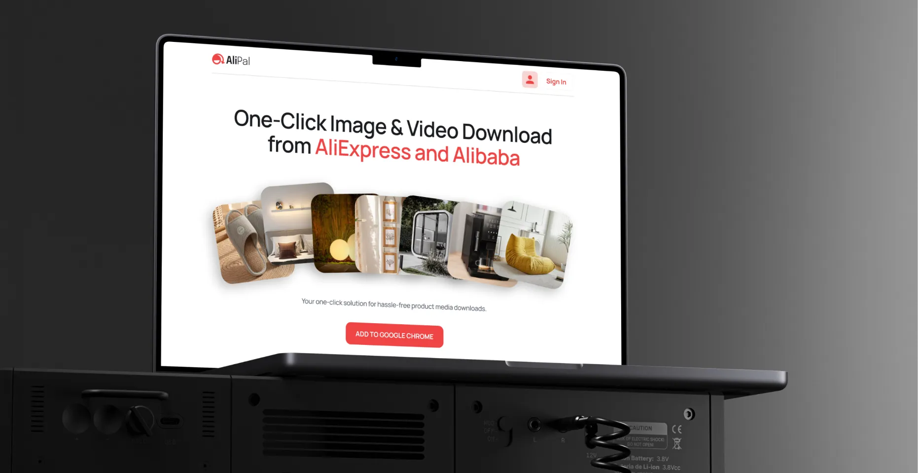
AliPal is a Chrome extension for dropshippers and e-commerce resellers who need product media from AliExpress and Alibaba fast. One click, all images and videos, original quality, packed in a ZIP. The brief was simple: here is what it needs to do - Brand, website design, and extension UI were all ours to figure out from scratch.
Users
Chrome Store rating
Designing a Chrome extension UI is a different problem from designing a website or a brand. The interface lives inside someone else's platform, layered on top of AliExpress and Alibaba product pages, so the usual rules don't apply. It has to feel like it belongs there, not like something dropped on top. That thinking shaped everything we did, from the brand to the landing page to the extension itself.
AliPal operates in a space full of tools that look unfinished. The identity needed to communicate instantly, because in a browser toolbar you have maybe a square centimeter to make an impression. Everything was designed around that constraint, a mark that reads clearly at any size, a palette that cuts through without noise, typography that stays consistent whether you're looking at the store listing, the website, or the popup UI inside your browser.


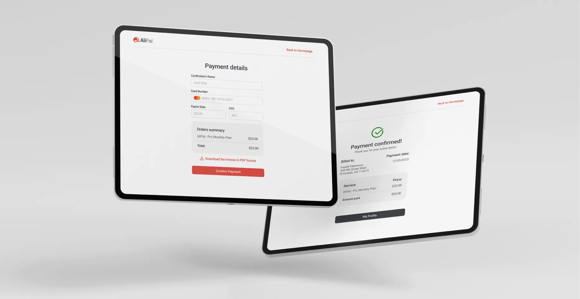
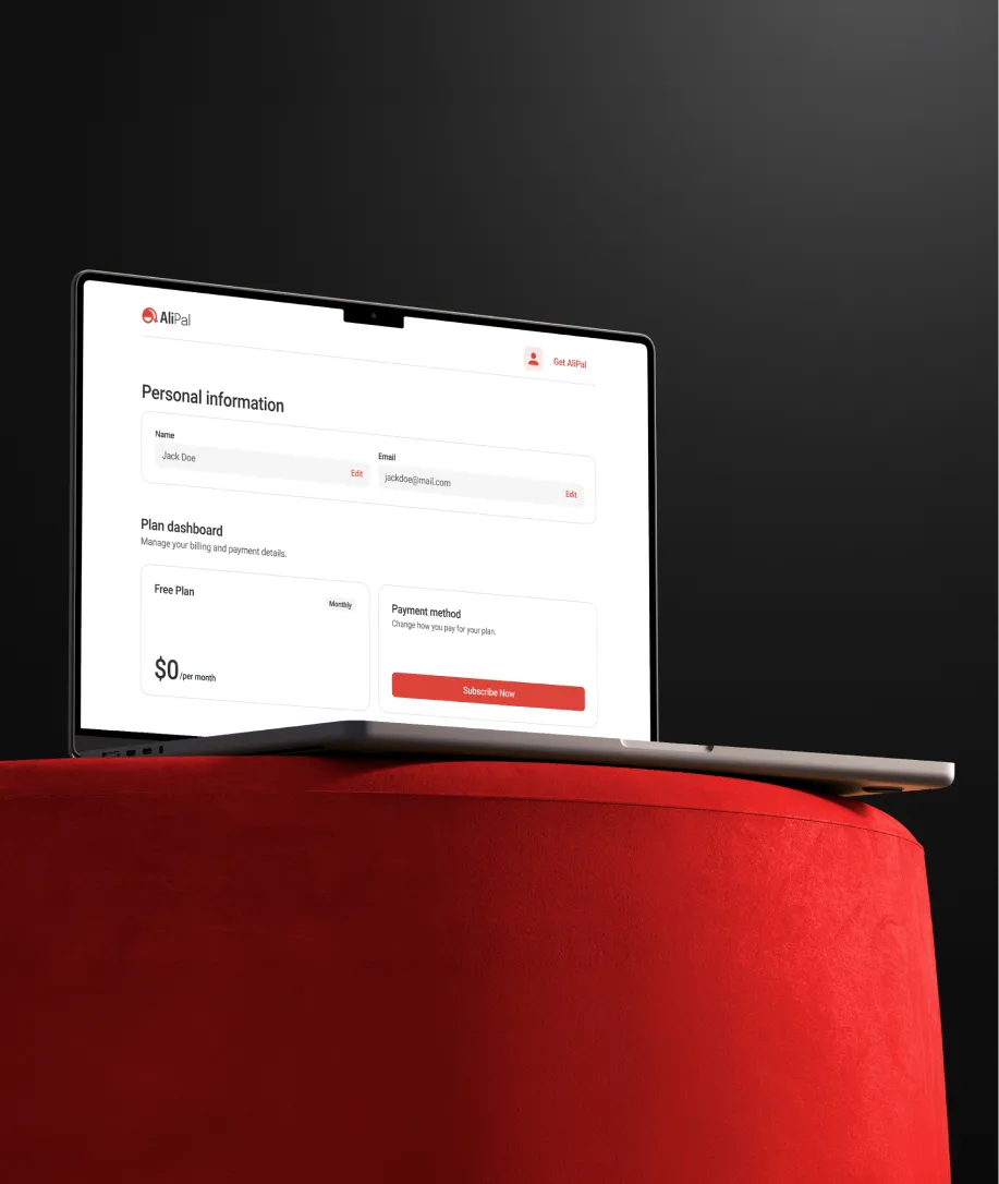
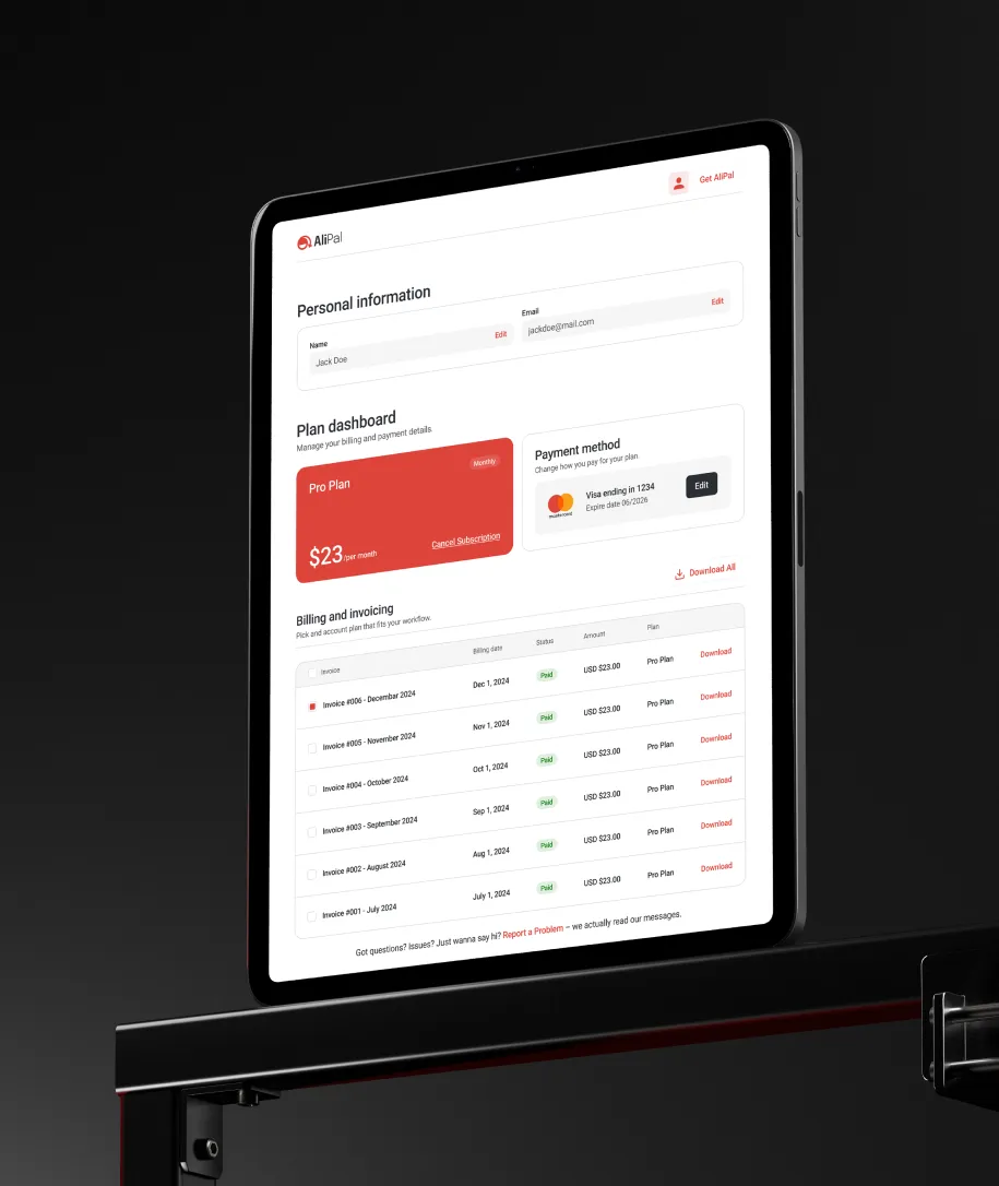
The website needed to cover everything a potential user looks for before committing to a Chrome extension: what it does, how it works, what it costs, and whether it's worth trusting. We designed the full experience, from the homepage and feature pages through to pricing, sign up, and login. Every page moves toward the same goal: install and subscribe.


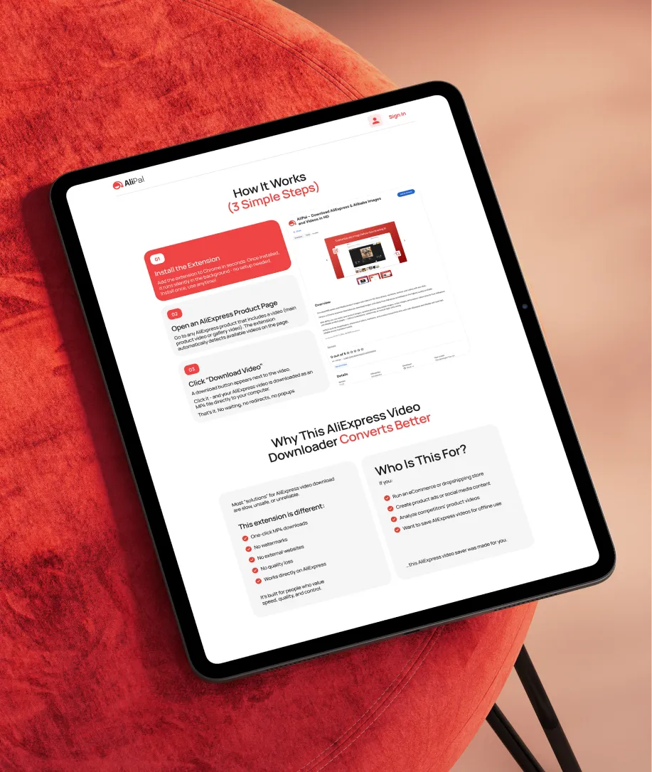
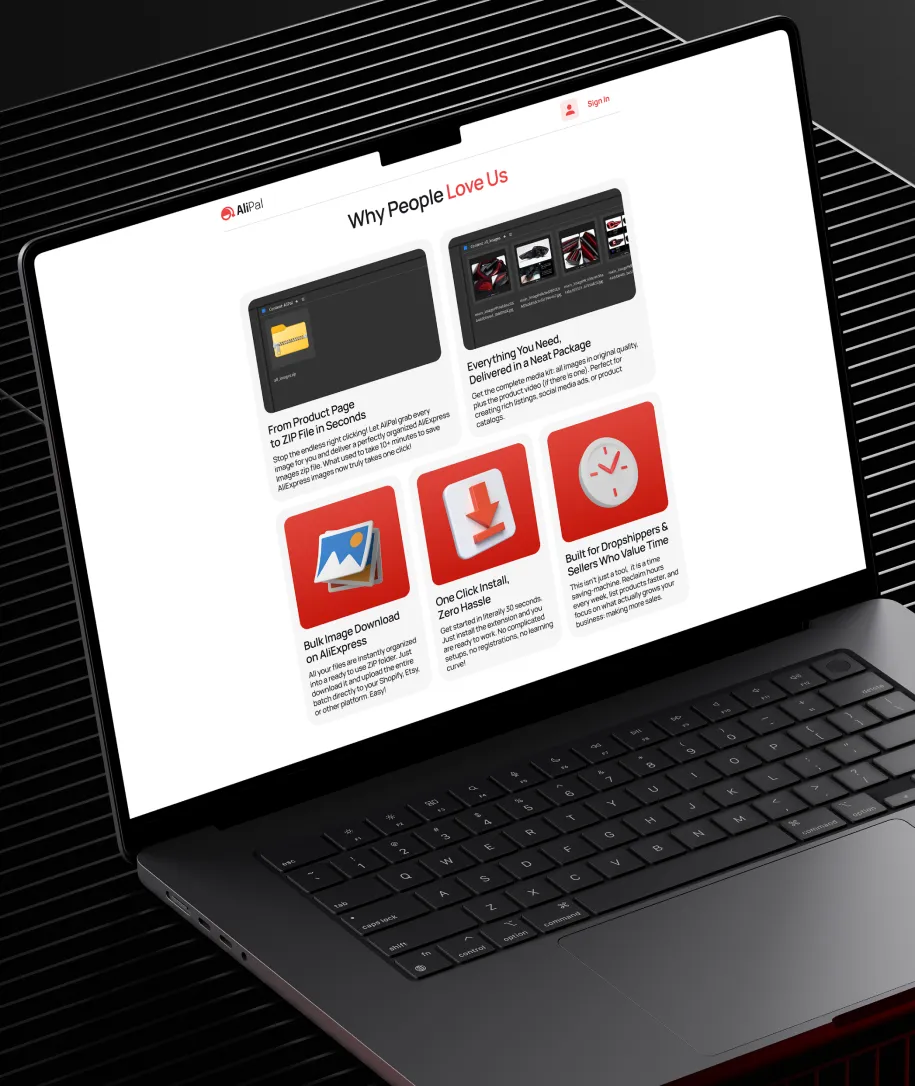
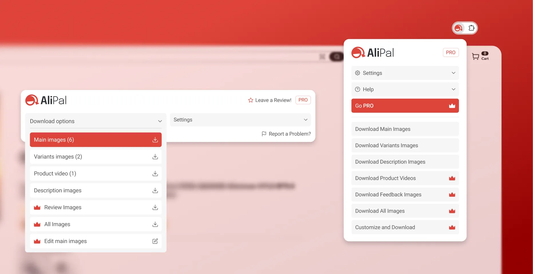
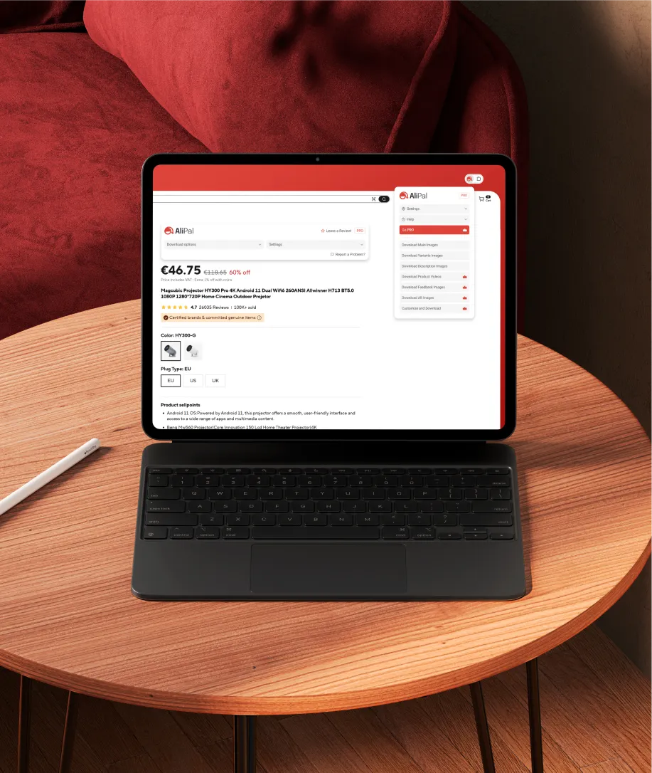
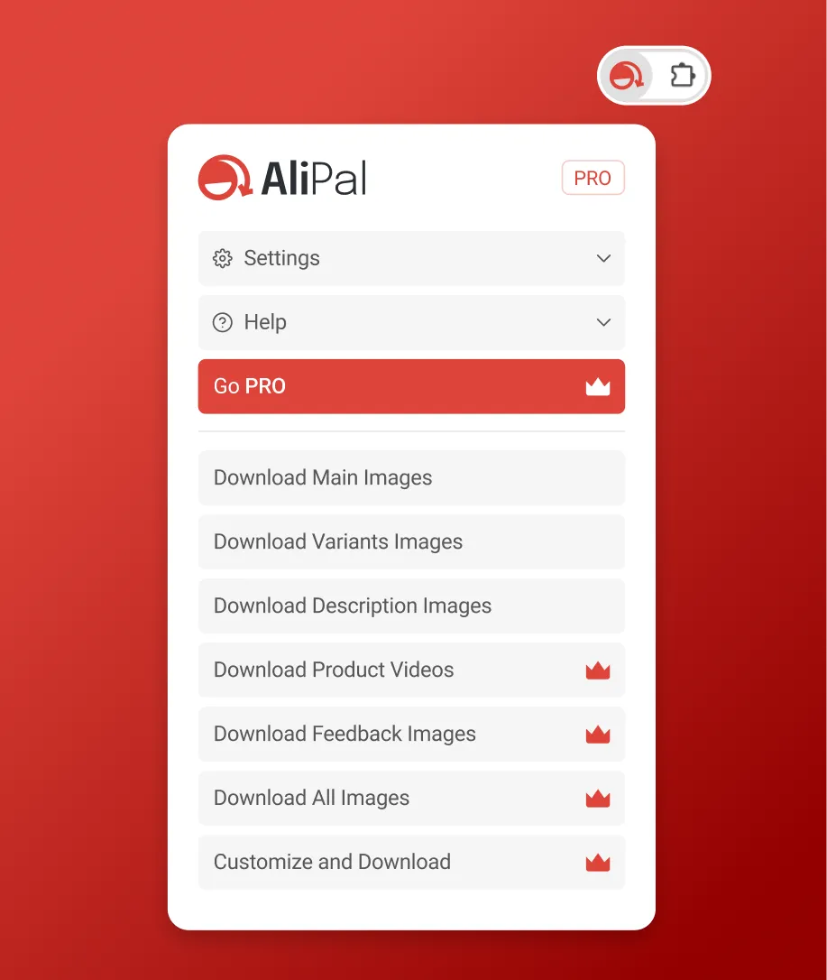
We designed a popup with clearly separated download options, free and pro, so users immediately understand what they get without digging through settings. Main images, variants, videos, description images, review images, each accessible separately or all at once. The built-in image editor means users can crop and resize without leaving the browser. Everything sits in a compact interface that opens in one click and gets out of the way when closed.
The design shipped exactly as we made it. The website is live, the extension is on the Chrome Web Store, and the UI inside the browser matches what we handed off.
Yes, and the earlier the better. A brand isn't just a logo, it's the visual and verbal system that everything else gets built on top of. If you go into development without one, you end up making design decisions inconsistently, which costs money to fix later. For AliPal, we built the brand first. By the time we touched the website and extension UI, every decision had a foundation to reference.
Design costs for a SaaS product, depending on scope, typically range from $5,000 for something simple to $40,000 and beyond for a full system with custom UI across multiple surfaces. For a project like AliPal, which included branding, a multi-page website, and extension UI, you're in the middle of that range. Use the calculator on our Get Started page to get a number based on what you actually need.
For a project covering brand, website, and product UI, you're typically looking at 8 to 12 weeks. Branding runs first, then website and product design follow using the same visual system. The biggest variable is how quickly decisions get made on the client side.
Because design is treated as the last step instead of the first. Developers build the functionality and then put something together to expose it. The result works but doesn't feel considered. For a product competing for installs in the Chrome Web Store, that first impression is often the only impression.
Yes. The Chrome Web Store listing alone doesn't do enough. A website is where you explain the product properly, show how it works, handle pricing, and build enough trust for someone to commit to an install and subscription. Without it, you're asking people to make a decision with half the information.
UX is the structure: how a user moves through a product, what they encounter and when, how decisions are organized. UI is how that structure looks and feels. You need both, and they're best done together by the same team. Separating them creates products that are logical but look rough, or that look good but are confusing to use.
It comes down to the quality of the handoff. Production-ready Figma files with properly named components, defined spacing, states, and interactions give developers exactly what they need to build without guessing. AliPal shipped 1:1 with the design we delivered because the files were built to be handed off, not just presented.
Not always. A logo is one piece of a brand system. If there's no style guide, no consistent typography, no defined color logic, and no rules for how the identity behaves across surfaces, then what you have is a logo, not a brand. Whether that needs rebuilding depends on where the gaps are. We can take a look and tell you honestly.
Updates from projects we're working on and lessons we're learning.
Sent when there's actually something to say.