
Notes we’d send a friend
Updates from projects we're working on and lessons we're learning.
Sent when there's actually something to say.
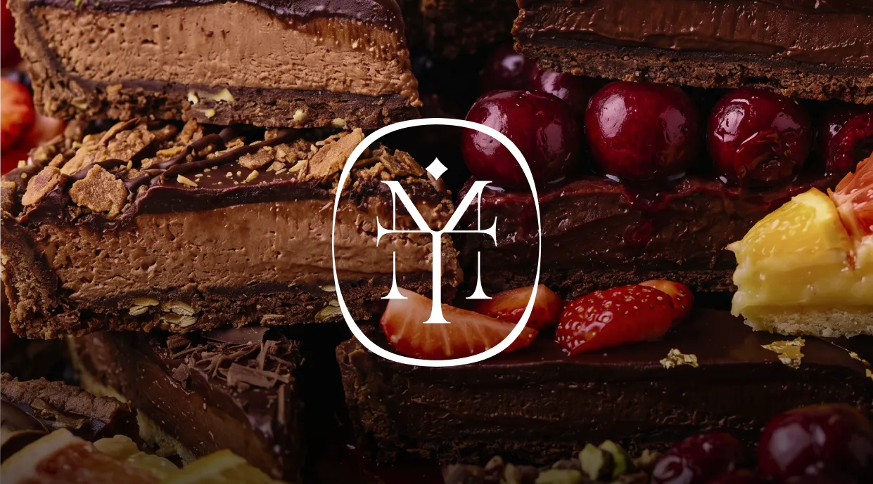
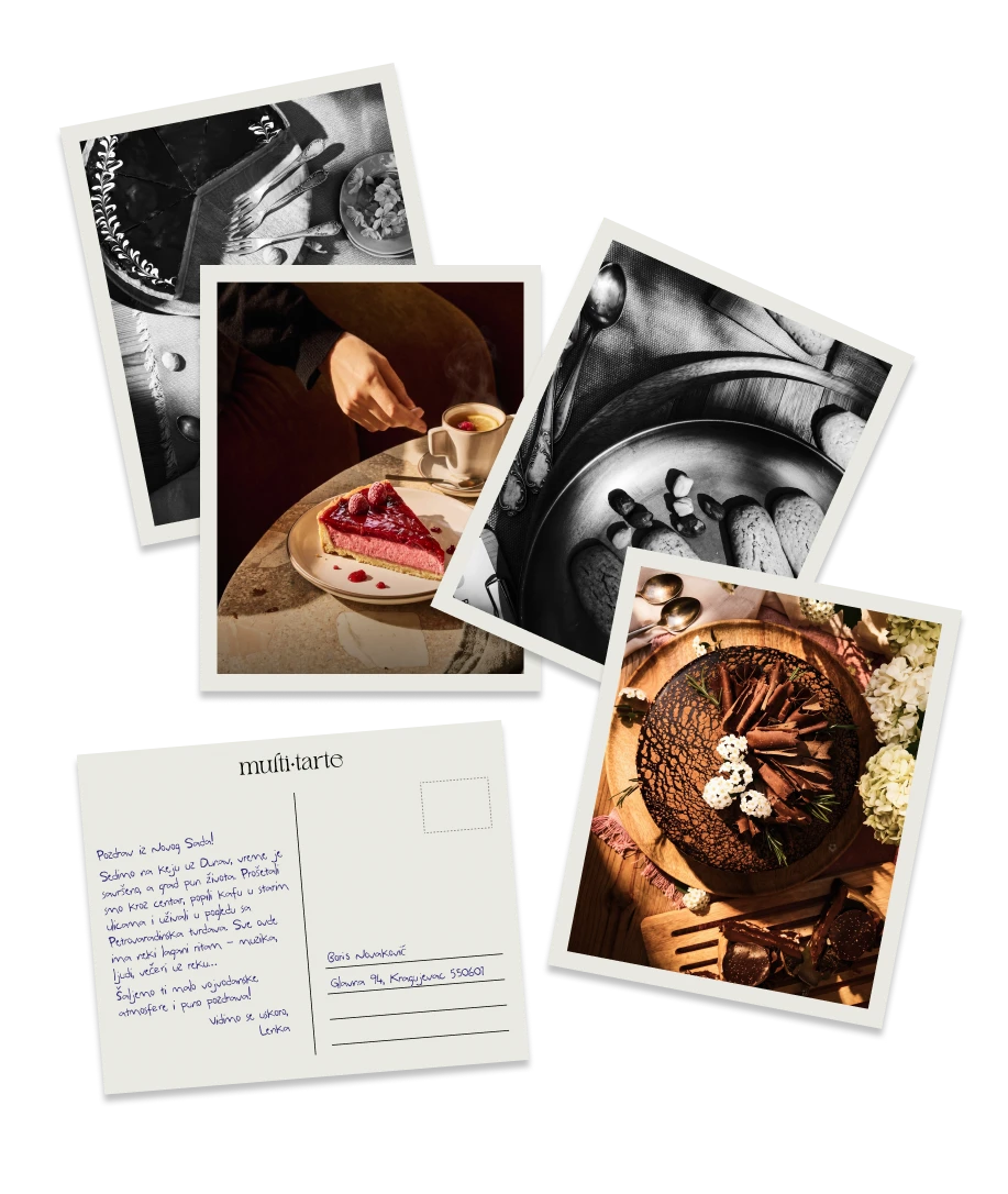
Multi Tarte has been serving Novi Sad since 1997 - French-style tartes made with local ingredients, techniques refined over decades. As their reputation grew, they needed a visual identity that could carry that story. We developed a heritage-focused brand system: custom monogram, typographic lockup, and flexible applications.
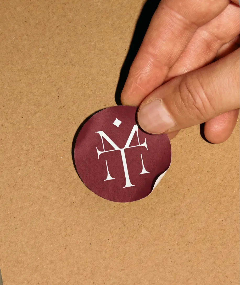
MT badge that works as a quality stamp
Serif system that feels like old Europe
Client:
Multi Tarte
Location:
Novi Sad, Serbia
Industry:
Food Manufacturing
Involment:
2026
After nearly 30 years in business, Multi Tarte's identity needed to evolve. Their original wordmark served its purpose, but as their reputation expanded, they needed something that could communicate their story at a glance.
The goal: create a mark that reflects their position as an established pastry workshop. Something that works across applications, from packaging to storefronts, while honoring their legacy and European baking roots.
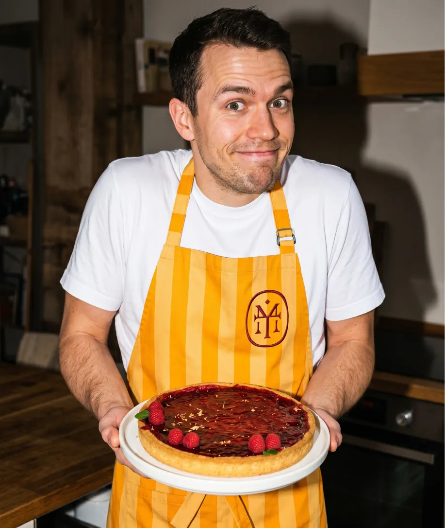
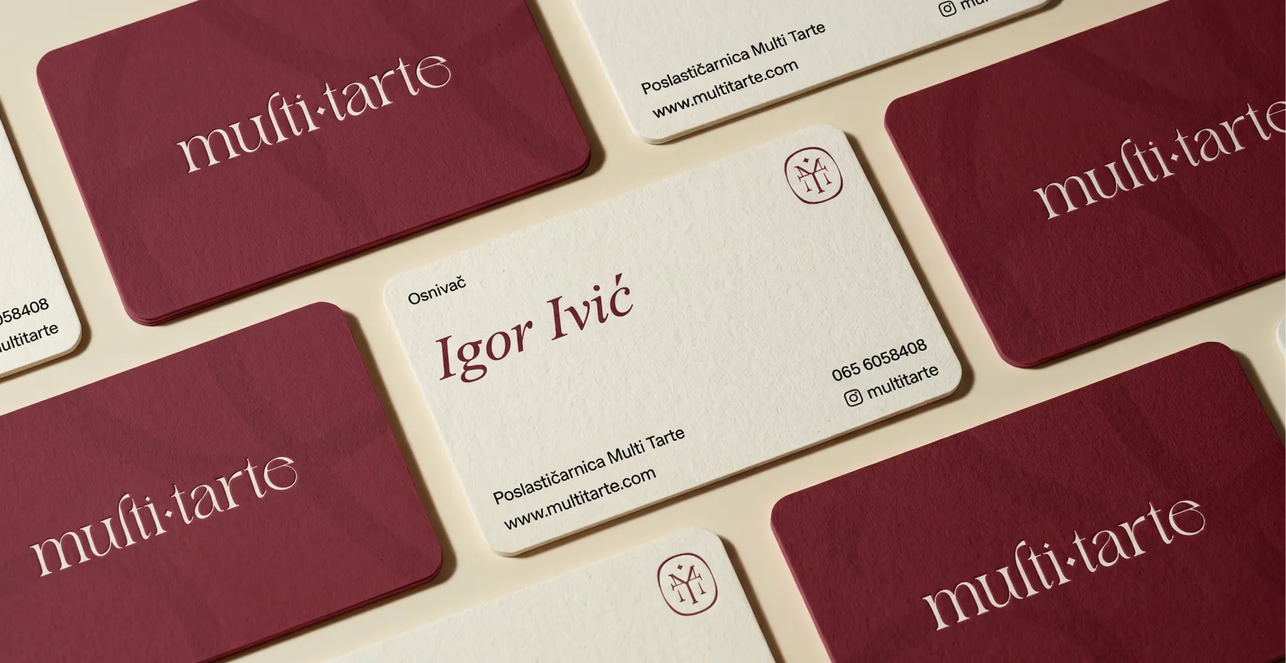
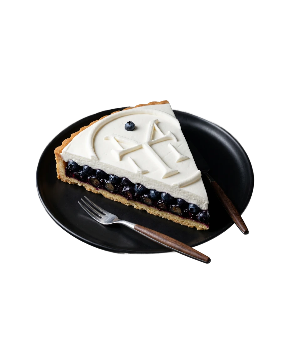
We developed a monogram badge system with "ESTD 1997" markers and a refined serif wordmark. The identity signals longevity and craftsmanship without losing approachability. It's built to grow with them over the next chapter.
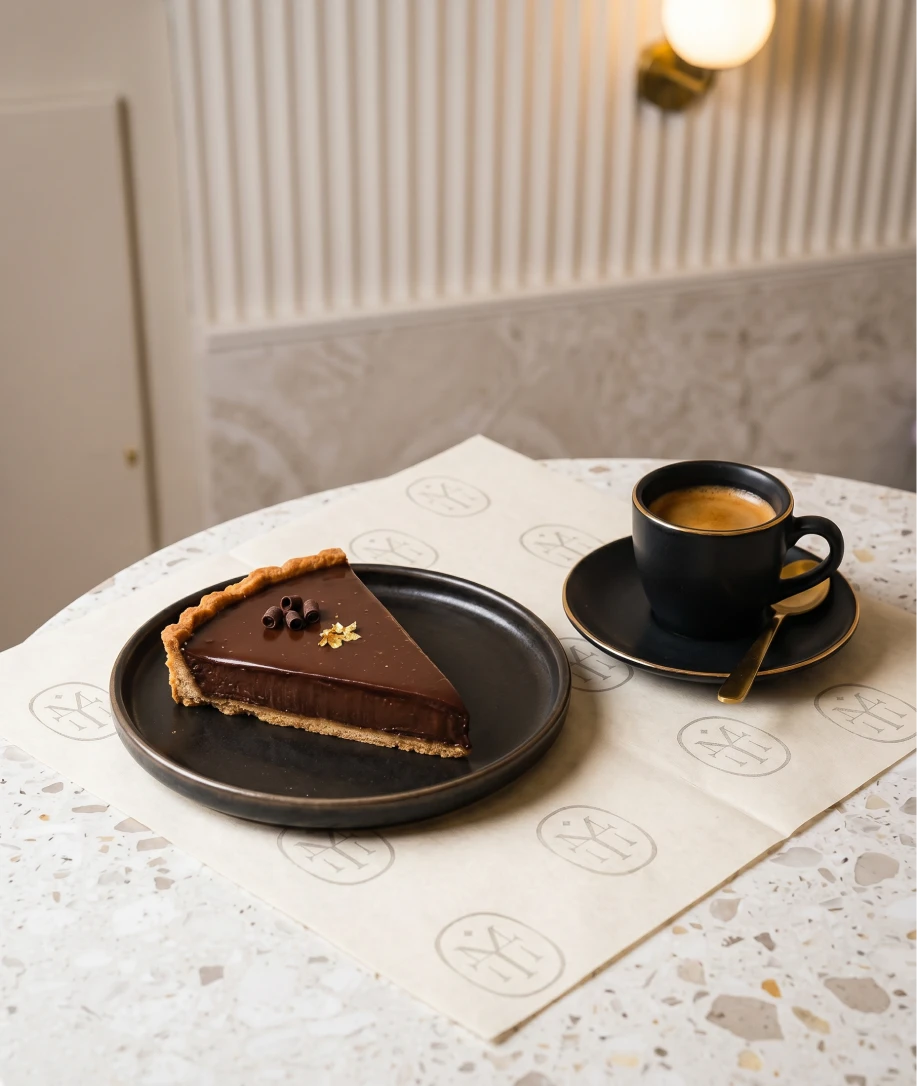
The monogram functions as both mark and seal-versatile enough for small applications like packaging stamps, clear enough for storefront signage.
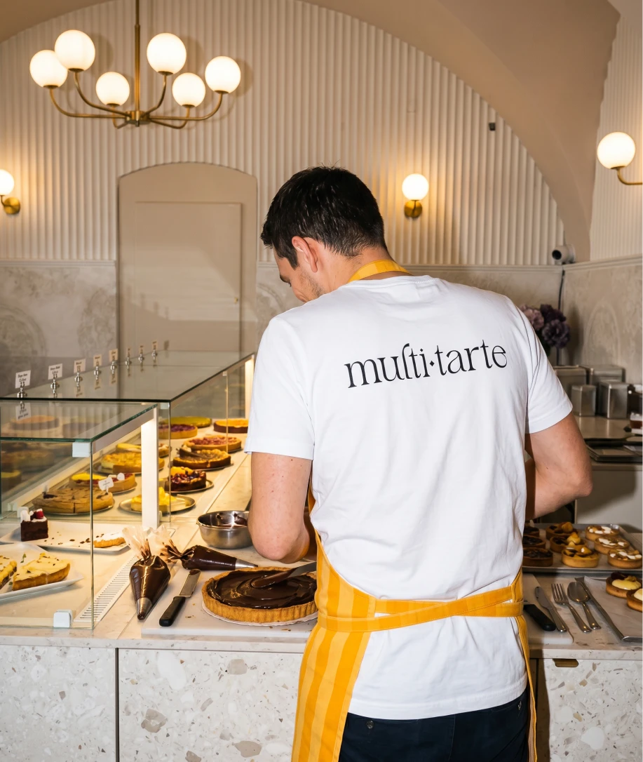
Typography balances European pastry tradition with readability. Serif references classic baking heritage, diamond accents add subtle detail, lowercase maintains warmth. The beige background creates softness while keeping strong contrast.
Three lockup variations handle different contexts: badge-only for small spaces, full system for primary applications, wordmark-alone for digital. Each configuration maintains visual consistency.


We explored four strategic directions. Script approach leaned casual. Typography-only felt clean but needed an anchor. Illustrated symbol took a contemporary angle.
The badge direction offered the most flexibility - something that could function as both identity and quality marker. We refined the monogram structure, adjusted spacing relationships, and developed the full typographic system around it.
Multi Tarte now has a comprehensive brand system that supports their growth. The monogram gives them a distinctive mark that works across all applications. The heritage lockup communicates their story clearly.
The identity positions them as an established institution while remaining accessible to new customers. It's a system designed to serve them well as they continue building on three decades of reputation.
Consider a rebrand when your business has evolved significantly from your original positioning. For Multi Tarte, nearly 30 years of growth meant their visual identity needed to reflect their current standing. Signs it's time: your business has expanded, your market positioning has changed, or your identity no longer represents who you serve and how you operate.
Bakery branding works best when it balances approachability with quality signals. The identity should feel welcoming to daily customers while communicating craft and standards. For pastry shops with heritage, incorporating establishment dates and traditional typography can reinforce credibility without feeling outdated.
A comprehensive logo design typically takes 4-8 weeks, including discovery, concept exploration, refinement, and final delivery. The process involves testing multiple strategic directions, gathering feedback, and ensuring the system works across all necessary applications - from digital to physical packaging.
A full brand system includes primary logo, alternative lockups for different contexts, typography guidelines, color specifications, and usage rules. For Multi Tarte, this meant developing three lockup variations (badge-only, full system, wordmark-alone) to handle everything from Instagram posts to storefront signage.
Heritage branding uses specific markers like establishment dates, traditional typography, and classic design elements—while keeping execution clean and contemporary. The goal is communicating longevity without feeling dated. This works particularly well for businesses where legacy and experience are competitive advantages.
It depends on existing brand equity. A refresh updates and refines while maintaining recognition. A complete rebrand rebuilds from strategy up. Consider your audience's connection to the current identity, how much your business has changed, and whether your existing mark has elements worth preserving. Both approaches have their place depending on business needs.
Updates from projects we're working on and lessons we're learning.
Sent when there's actually something to say.