Notes we’d send a friend
Updates from projects we're working on and lessons we're learning.
Sent when there's actually something to say.
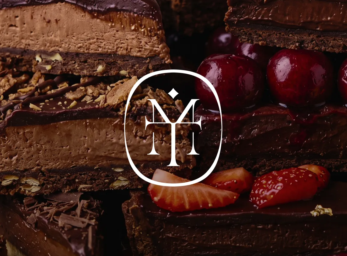
Olgica Mitić spent ten years perfecting her craft as a nail artist and educator. Her work spoke for itself in person, but online she was invisible. We built October Care from the ground up: a brand that finally shows what she's been proving all along.
increase in student enrollment
daily salon revenue growth
education business revenue
Client:
October Care
Location:
Novi Sad, Serbia
Industry:
Beauty / Nails
Involment:
2023 - Ongoing
The nail industry in Novi Sad is crowded. Scroll through Instagram and you'll find dozens of technicians with similar feeds, similar pricing, similar aesthetic. Pink tones, script fonts, template websites. Everyone looks the same because everyone is doing the same thing.
Olgica wasn't the same, but a stranger scrolling past had no way to tell. People who worked with her understood her value and kept coming back. That reputation existed in the room, not on a screen. She had steady clients and a small education business, but she'd hit a ceiling. The work spoke for itself once people experienced it. The problem was getting them through the door first.
Before designing anything, we studied the competition. Other salons in Novi Sad were pulling from the same template: pink tones, script fonts, generic websites. We did the opposite.
October Care needed to feel personal because the business is personal. The name comes from the birth month Olgica shares with her daughter, both born a day apart in October. The star in the logo represents the October soul symbol. These aren't invented marketing stories. They're real details from her life that we built the brand around.
The visual direction followed the same principle: premium, warm, grounded. A brand that earns trust before anyone books an appointment.
We built a visual system that stands apart from the typical nail salon aesthetic. Earthy tones instead of pink. Thoughtful typography instead of script fonts. A custom icon library instead of generic clip art. Every element was designed to communicate premium quality while staying grounded in Olgica's personal story.
The logo is built around the letter O with a star at its center, a reference to the October soul symbol that ties directly back to Olgica's personal story. It works at any size, from embroidery on packaging to a tiny favicon. Nothing else in her market looks like it.
The system includes a full wordmark for primary branding, a standalone symbol for tighter placements, and a text-only version for contexts where the mark would be redundant. Each variation feels like the same brand, just adapted to fit the space it lives in.
Most nail salons default to pink, white, and rose gold because it feels safe and feminine. We wanted October Care to stand apart, so we built the palette around earthy, grounded tones: deep matte black, hunter green, olive, vanilla, almond. These are colors you'd expect from a high-end skincare line, not a local beauty business, and that contrast is intentional. When someone scrolls past, the brand doesn't blend into everything else.
Typography follows the same thinking. Ethereal handles headlines with enough personality to feel crafted, while Clash Grotesk keeps body copy clean and readable. Together they strike a balance between elegance and practicality.


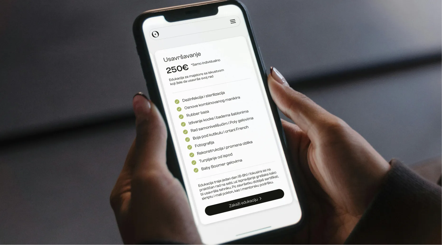
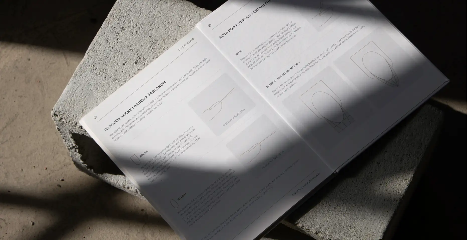
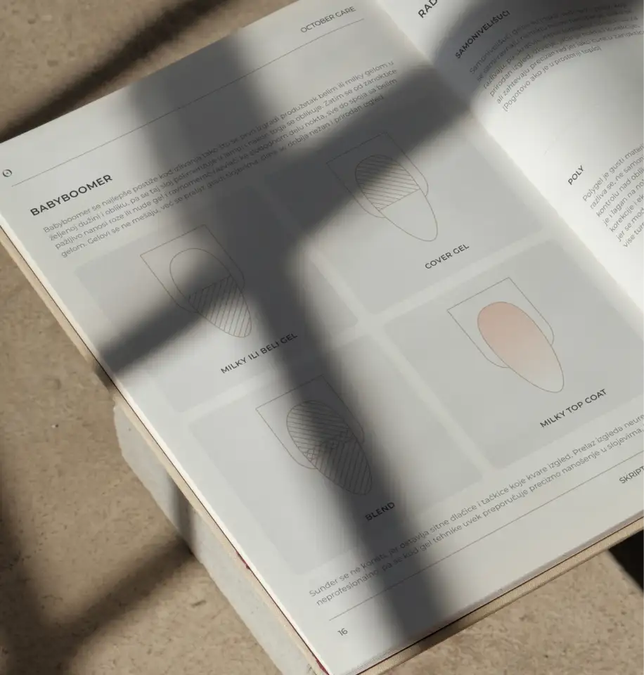
Education makes up a significant part of October Care's business, which meant we needed a visual system that could do more than look good. We designed a custom icon set covering every tool, material, and process in her curriculum, from sterilizers and nail files to UV lamps and application templates. These icons appear throughout the education scripts, helping students learn while reinforcing the brand at every touchpoint.
A brand only works when it shows up consistently across every touchpoint. We designed October Care's applications to feel cohesive whether someone encounters the brand online, in the salon, or through the education program. From the website that books appointments to the gift box students take home, every piece reinforces the same premium, grounded identity.
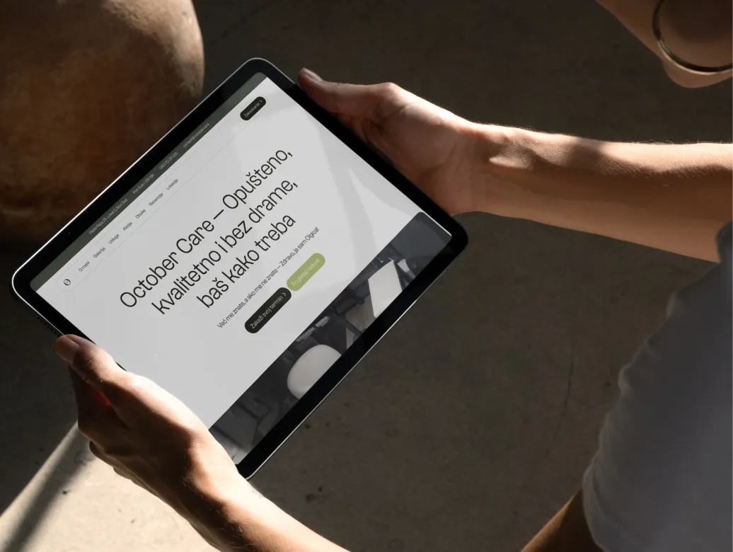
People would find Olgica on Instagram, want to learn more, and have nowhere to go. No website meant no way to explain her services, show her pricing, or let someone book without sending a message and waiting for a reply.
We designed a one-page website that answers every question a potential client might have. What services does she offer, what do they cost, how does the loyalty program work, and how do I book. The site connects to Fresha and Sredime for appointments. It pulls in her Instagram feed so recent work stays visible without manual updates. A blog section will support ongoing SEO efforts, bringing organic traffic from people searching for nail services and education in Serbia.
Before working with us, Olgica's training materials were informal: verbal instruction with handwritten notes. We created two comprehensive branded scripts covering nail anatomy, hygiene protocols, and step-by-step techniques, illustrated with custom icons throughout.
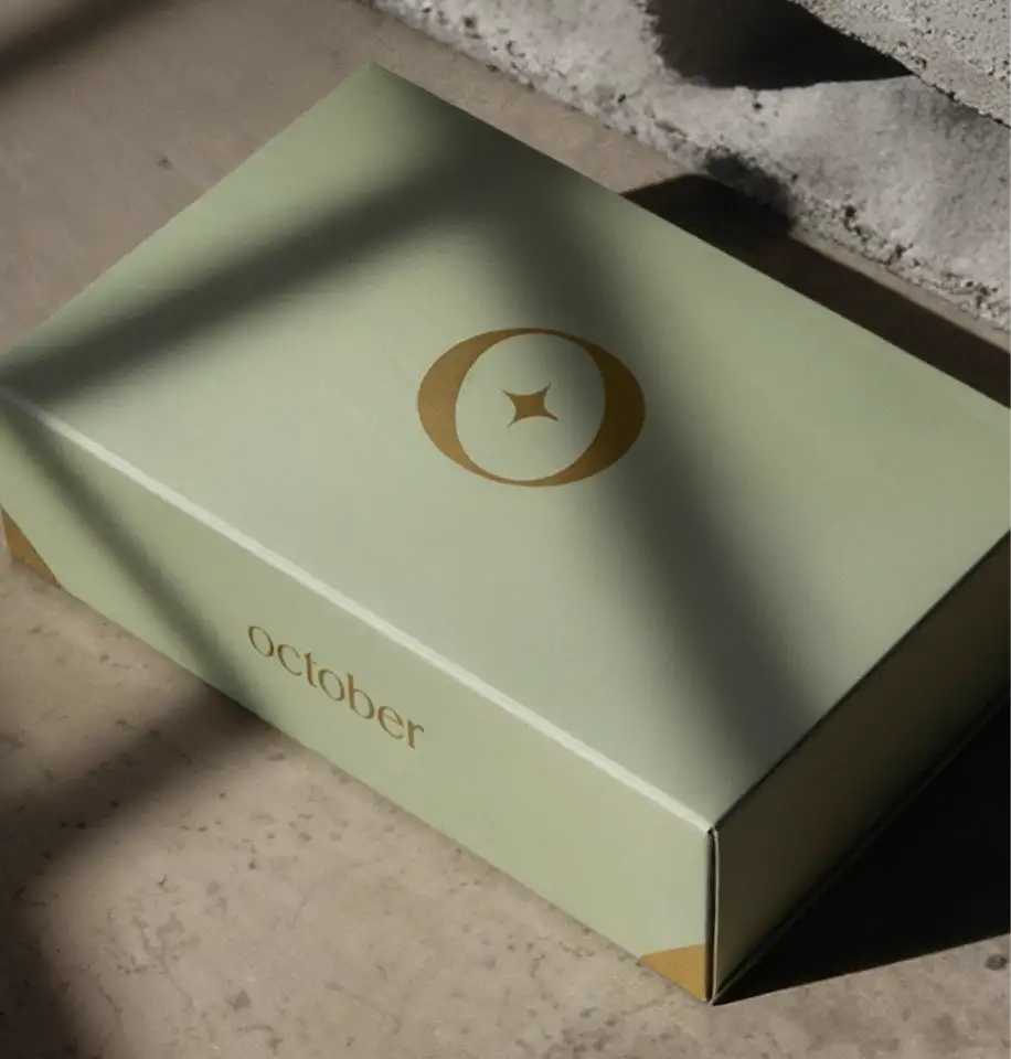
When students finish training, they receive a branded gift box with everything they need to start working: the script, a personalized certificate, and starter tools in individually designed packaging. The olive green box with botanical patterns inside gets photographed and shared, becoming marketing that costs nothing after the initial investment.
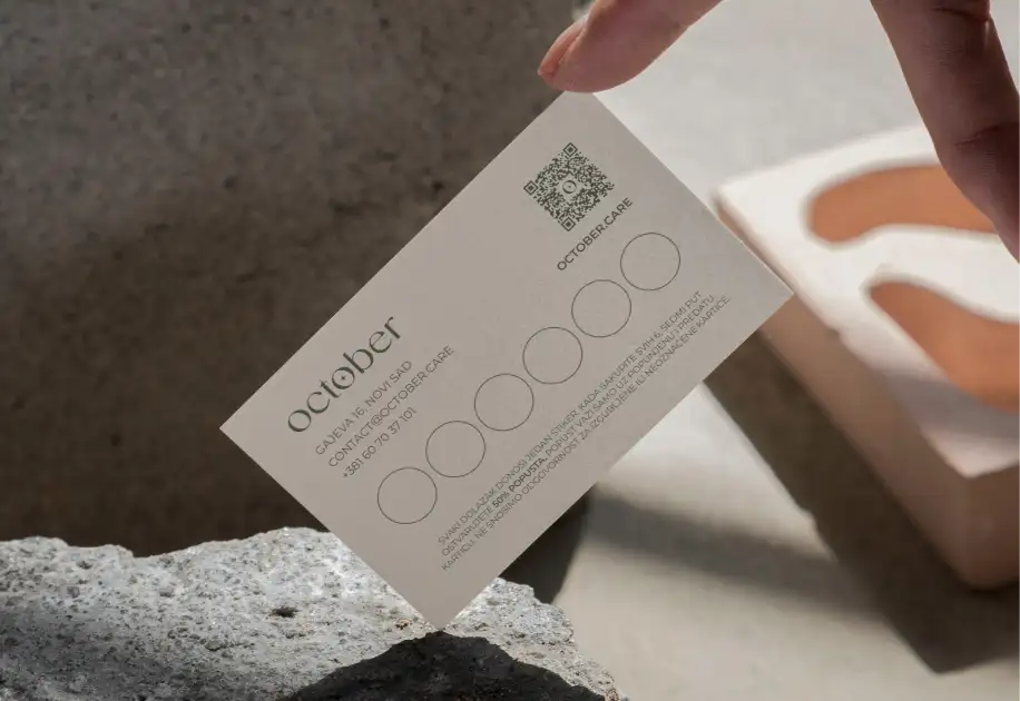
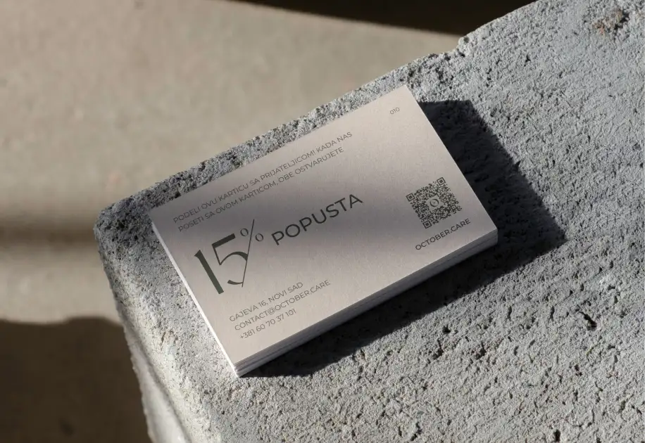
A business card gets handed out constantly in a business like this. It needed to feel like the service itself, something worth holding onto rather than tossing in a drawer. We kept it minimal: quality stock, clean layout, just the logo and contact details.
Loyalty cards serve a double purpose. They reward clients for coming back, but they also put the brand in their wallet where they'll see it regularly. Every time someone pulls it out, the impression reinforces itself. We also designed packaging for October Care's own product line, cuticle oils and hand creams that clients take home and use between appointments.
Her education business saw the biggest shift. Before October Care, she ran three or four trainings per year. Now she runs two per month, a 6x increase in student enrollment and a 7x increase in education revenue. The branded materials and gift box experience made her training feel worth the price. Because it is worth the price.
The salon business grew alongside it. Daily client bookings went from two appointments to at least five, a 2.5x increase in daily revenue. October Care went from invisible to undeniable. Not because we made pretty things, but because we built a system that communicates value at every touchpoint. The brand finally matches the skill, and the revenue reflects it.

OIgica Mitić
Founder
I highly recommend Bykreator Studio to anyone who has an idea and wants to build a serious business…I can't express my gratitude enough and the results I've achieved thanks to them. Even though I was afraid of big changes and having to hand over my salon to someone else, I'm so glad I chose them. Thank you guys!
Branding packages start at $3,500 and vary based on scope. This typically includes your core identity (logo, colors, typography), brand guidelines, and essential applications like business cards and presentation styling. The final cost depends on what you need: some salons just want the visual system, others need packaging, education materials, and digital assets included.
Yes. Instagram drives awareness, but a website converts interest into bookings. When potential clients find you on Instagram, they look for your website to check services, pricing, and book appointments. Without one, you're forcing them to DM and wait. A simple site with booking integration removes that friction and dramatically improves conversion rates.
Branding projects typically take 4-6 weeks. Websites take 6-10 weeks depending on complexity. If you're doing both together, expect 8-12 weeks total. October Care's branding took 6 weeks, with the website developed in parallel. We'll give you a clear timeline upfront based on your specific scope.
Absolutely. If your logo works, we keep it and build the complete system around it (colors, typography, guidelines, materials). Or we can refine it if something feels off. You don't always need a full rebrand. Many salon owners just need the supporting elements to create consistency across all touchpoints.
Strategic branding solves this. Most nail salons default to pink, script fonts, and templates because it feels safe. We research your local market first, then position you differently. October Care used earthy, premium tones instead of typical beauty colors and immediately stood apart from dozens of competitors in Novi Sad.
Standard websites ($5,000+) include responsive design, booking integration (Fresha/Sredime), services and pricing pages, Instagram feed, CMS for easy updates, and mobile optimization. Once complete and paid, you own everything: the site, design files, and full control. No ongoing fees to us unless you want maintenance support.
If you're getting clients through word-of-mouth but struggling to attract new ones, branding is the leverage point. October Care went from 3-4 trainings per year to 2 per month after rebranding (6x increase). Daily salon bookings more than doubled. The rebrand made her value visible, which directly impacted revenue growth.
Yes. We design flexible systems that work across multiple business lines. October Care's brand works for salon services, retail products (oils and creams), and premium education programs. One cohesive identity, multiple applications. The materials feel consistent whether someone encounters you as a client, student, or retail customer.
Updates from projects we're working on and lessons we're learning.
Sent when there's actually something to say.